San Antonio Graphic Design
Case Study
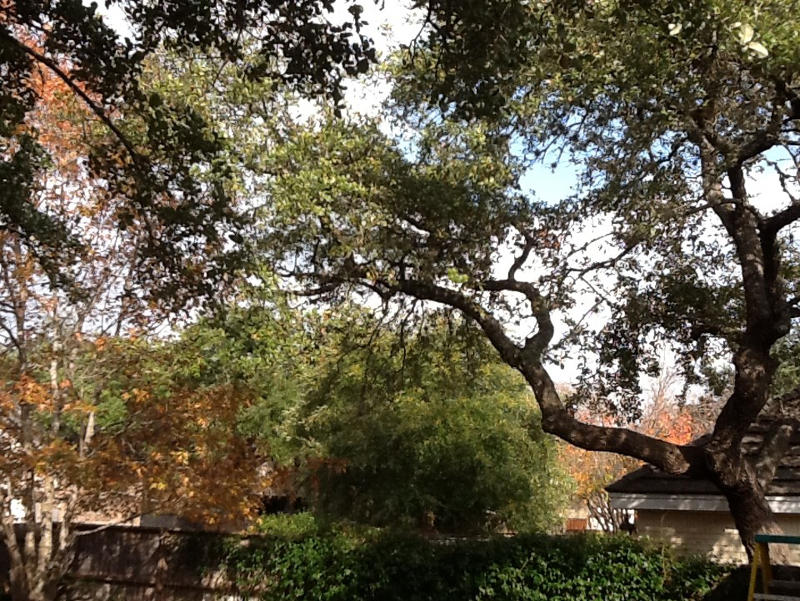
We had an interesting request from a client at Briar Patch consulting. Our client was distraught over the construction plans proposed by his neighbor. The neighbor intended to build a large, two-story extension over his backyard garage. As you can see from the image below, the current garage has a minimal footprint and does little to obstruct his view.

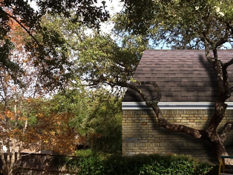
Needless to say, when our client viewed his neighbors architectural drawings, he was compelled to take action. We were hired to create an accurate representation of what the new view would look like using the image above. The goal was to help the neighbor and the homeowner’s association understand the degree of obstruction and the potential loss of property value. There were several things we needed to accomplish in order to meet these goals.
Measurements and Reference Points
Using a copy of the architectural drawings, we were able gather the precise dimensions of the new structure. We also needed to get a reference point on the photo so the proper scale could be calculated. Luckily, we had access to a mathematician who helped us pinpoint the length and height of the structure, the roof-lines and the slope.
Alpha Channel
After establishing the reference points on the photo, we had to erase the area where the new structure would stand. The challenge was in keeping the large tree in the foreground. Photoshop and Gimp are great tools for graphic design. Personally, we use Gimp, simply because it’s free. Anyone who has worked on a project like this knows how time consuming it can be to etch out an alpha channel at the pixel level. Overall, the process took a little over an hour.
Building a New Garage
The garage had to be pieced together from three different photos. We needed a roof that sloped at the same approximate angle, white trim with gutters, and a brick wall of a similar color. Each image had to be sized, shaded and colored to match the proposed building. It’s important to note that our client wanted the image to look as realistic as possible.
Layers and Shading
The three images that formed the house were added as three separate layers inside the alpha channel. I had to darken the edges and add a slight blur effect to make the new building appear less stark inside the photo. Finally, I copied the tree inside the alpha channel and moved it to a new layer. Then I created a shadow for the tree. Here’s the final image:

San Antonio Graphic Design
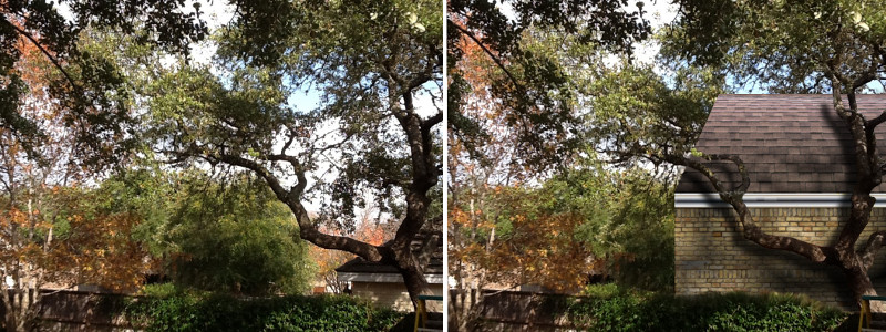
Here are the two images side-by-side:

When our client saw the photo, he said, “That’s exactly what I was looking for. At Briar Patch Consulting, we pride ourselves in helping people on projects like these. If you need help from a San Antonio graphic design artist, give us a call @ (210) 390-4500. We also love designing new websites and running digital marketing campaigns. Finally, this project was just fun.


